iPhone Duo Vertical Bars in iOS 27: What Changes in SwiftUI and UIKit
Apple moves key navigation and controls to vertical bars on iPhone Duo. Here is what is automatic, what is not, and what developers should test.
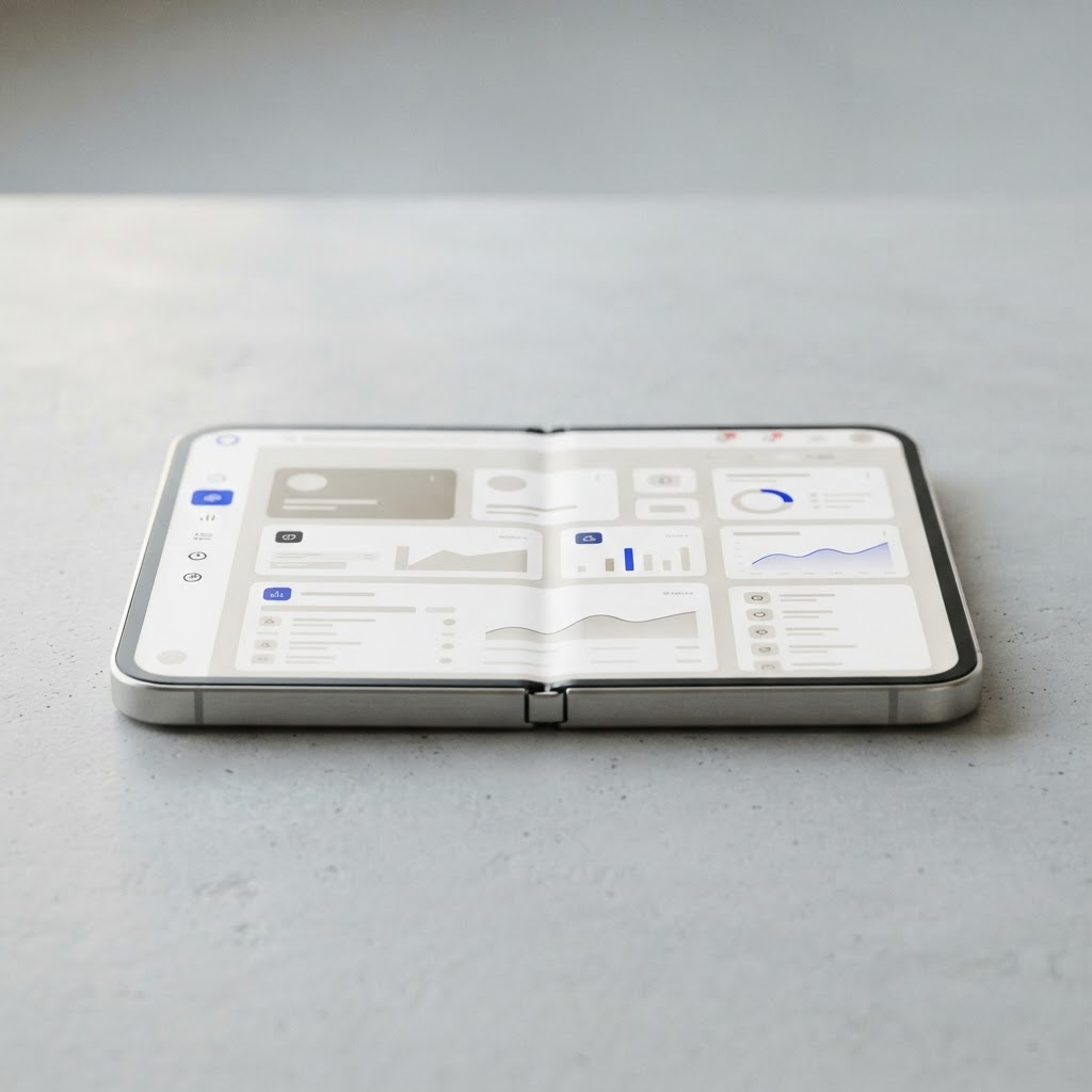
iPhone Duo changes more than the width of an app. In several configurations, iOS 27 moves system navigation and controls into vertical bars so the content area can use the device’s unusual proportions more effectively. That is an operating-system behavior, not a visual trend developers should imitate with a custom rail.
What Apple has confirmed
Apple’s iPhone Duo design guidance and its “Raise the bar” developer session show bars adapting to the available geometry. Controls that traditionally occupy the top or bottom edge can move to a side edge. The exact result depends on the scene size, orientation, presentation, and system container your app uses.
The important distinction is ownership. System bars built with standard SwiftUI and UIKit containers can participate in this adaptation. A custom tab bar drawn with stacks, manual frames, or fixed safe-area assumptions does not automatically become a native vertical bar.
SwiftUI: preserve semantics first
Start with TabView, NavigationStack, NavigationSplitView, toolbars, and semantic placements. These APIs tell the system what a control means instead of only where it should appear.
A good migration sequence is:
- Replace hand-built navigation controls where a system container can express the same hierarchy.
- Remove fixed bar heights and width calculations copied from older iPhones.
- Test compact and expanded scene sizes, not only named device orientations.
- Confirm that selection and navigation state survive an interactive resize.
- Check every toolbar item with larger Dynamic Type and VoiceOver.
Do not branch on a marketing device name. Apple’s guidance is consistently geometry-driven: respond to the space your scene receives.
UIKit: audit the container hierarchy
UIKit apps should review UITabBarController, UINavigationController, UISplitViewController, safe-area constraints, and custom presentation controllers. Standard containers give iOS the information it needs to adapt. Custom chrome may require a redesign rather than another set of offsets.
Search your codebase for assumptions such as screen.bounds, hard-coded status-bar heights, bottom constants derived from one device, and logic that treats landscape as synonymous with wide. On iPhone Duo, posture, scene size, and display choice can break those shortcuts.
The asymmetry problem
A vertical bar means the content rectangle may no longer be visually symmetrical. Centering an object inside raw bounds can look wrong if a system bar occupies one side. Use the safe area and the geometry supplied to the scene. For media, games, and canvases, decide deliberately whether content should fit, fill, or extend under system UI.
This also affects sheets and popovers. Their anchor and available space can change while the app remains active. A presentation that looked attached to a bottom control may need to remain understandable when that control moves to a side.
What is not automatic
Apple has not promised that every custom tab bar, web navigation pattern, or third-party UI framework will transform correctly. Native semantics improve the odds; they do not remove the need for testing.
Pay particular attention to:
- labels that truncate when a horizontal row becomes a vertical stack;
- badges and selection indicators with insufficient contrast;
- drag targets placed too close to the hinge-side edge;
- overlays positioned from full-screen coordinates;
- keyboard shortcuts or focus order that still follow the old visual arrangement.
A practical test matrix
Run the app closed, fully open in both major orientations, side by side with another app, and through a live resize. Repeat with large text, Reduce Motion, right-to-left language, and VoiceOver. Capture screenshots only after state restoration has completed; a pretty static frame can hide a broken transition.
Our reading
The real migration is from coordinate-based chrome to semantic containers. Vertical bars are the visible symptom. The durable engineering work is removing assumptions about where navigation must live. If your app describes hierarchy and actions clearly, iOS can do more of the adaptation. If your app describes only pixels, iPhone Duo will expose that debt quickly.
Spotted something to fix, or an app we should cover?
This article is independent research, cross-checked against Apple's developer documentation. If something's out of date, or you know an app that deserves a look, let us know — and if you're building for iPhone Duo yourself, we're happy to talk.
hola@ayudantedigital.es